Dash Draggable
Contents:
Description
Dash draggable is a collection of dash component for building dashboards with drag and resize functionnalities.
Dash draggable comes with the following components:
A responsive or fixed layout with draggable and resizable elements:
(upcoming) components to drag freely (without grid)
(upcoming) components to drag and drop items in lists (trello-like)
Under the hood Dash Draggable is an interface (with some wrapping) to the following React component:
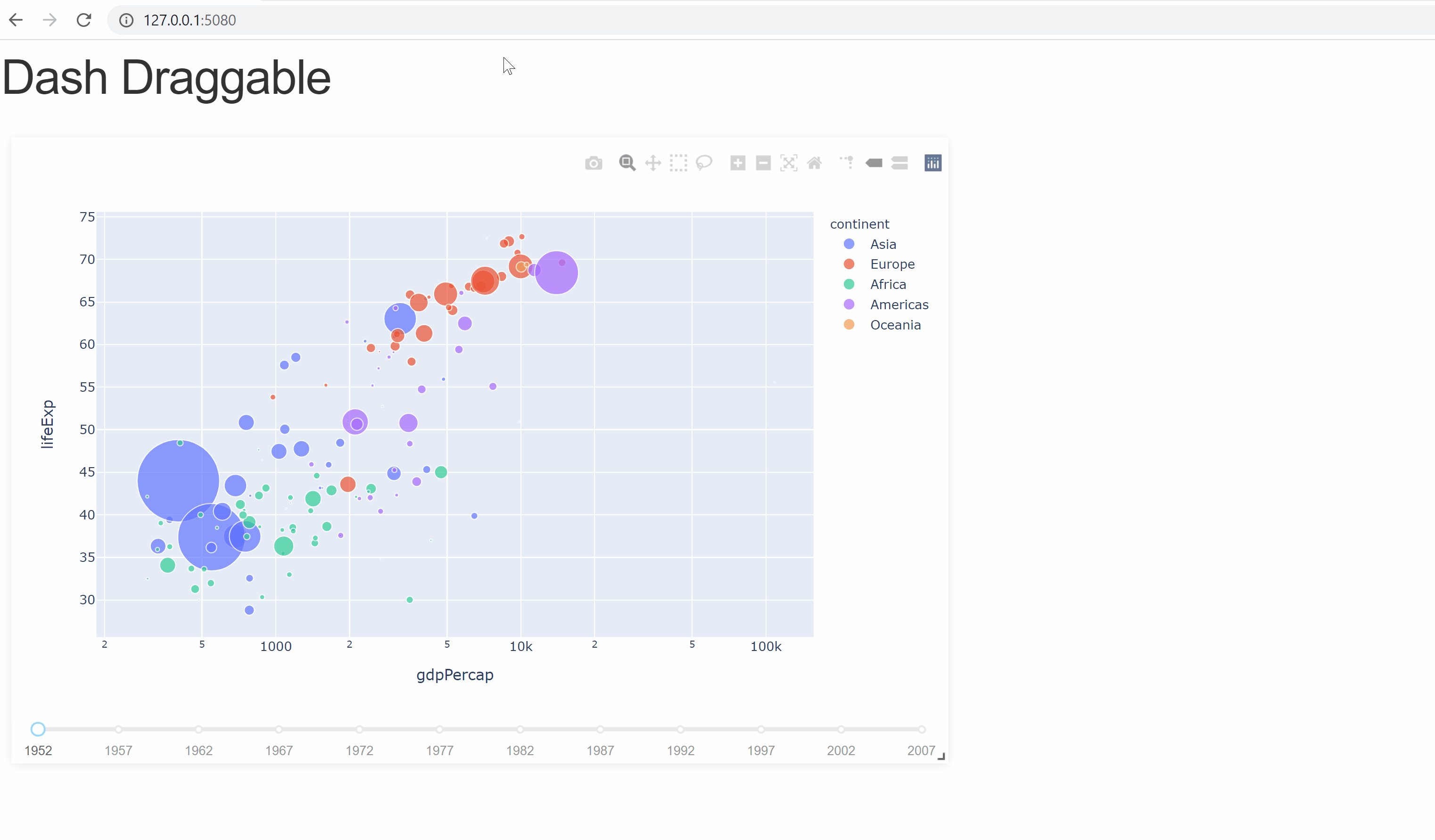
Your first dashboard (fixed size)
The following code will give you a simple dashboard with an item containing a chart that you can drag and resize.
You can see a live demo of this example here.
You can refer to the Overview section for more details on how to build dashboard using dash-draggable.
You can also browse the other examples, for more illustrations.
import dash
from dash.dependencies import Input, Output
import dash_core_components as dcc
import dash_html_components as html

import plotly.express as px
import pandas as pd

import dash_draggable


external_stylesheets = ['https://codepen.io/chriddyp/pen/bWLwgP.css']

app = dash.Dash(__name__, external_stylesheets=external_stylesheets)

server = app.server

df = pd.read_csv('https://raw.githubusercontent.com/plotly/datasets/master/gapminderDataFiveYear.csv')

app.layout = html.Div([
   html.H1("Dash Draggable"),
   dash_draggable.GridLayout(
      id='draggable',
      children=[
            html.Div(children=[
               dcc.Graph(
                  id='graph-with-slider',
                  responsive=True,
                  style={
                        "min-height":"0",
                        "flex-grow":"1"
                  }),
               dcc.Slider(
                  id='year-slider',
                  min=df['year'].min(),
                  max=df['year'].max(),
                  value=df['year'].min(),
                  marks={str(year): str(year) for year in df['year'].unique()},
                  step=None)
               ],
               style={
                  "height":'100%',
                  "width":'100%',
                  "display":"flex",
                  "flex-direction":"column",
                  "flex-grow":"0"
               }),
      ]
   ),
])


@app.callback(
   Output('graph-with-slider', 'figure'),
   Input('year-slider', 'value'))
def update_figure(selected_year):
   filtered_df = df[df.year == selected_year]

   fig = px.scatter(filtered_df, x="gdpPercap", y="lifeExp",
                     size="pop", color="continent", hover_name="country",
                     log_x=True, size_max=55)

   fig.update_layout(transition_duration=500)

   return fig

if __name__ == '__main__':
   app.run_server(debug=True, port='5080')
Overview
Currently dash-draggable allows you to use either a fixed size or a responsive layouts.
Fixed size layouts
The minimal code for using a fixed grid layout is the following:
app.layout = html.Div([
   dash_draggable.GridLayout([
      # my items
   ])
])
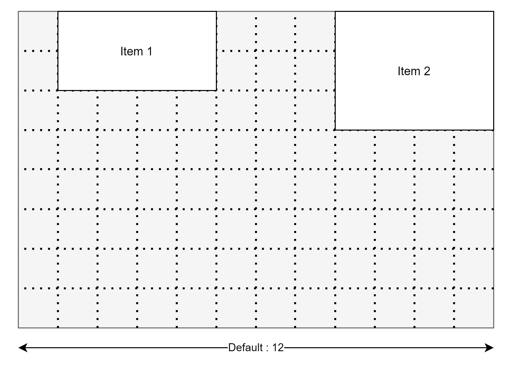
By default the items are put on a 12 columns grid layout with a width of 1200px. Those parameters can be changed using the arguments gridCols and width.
The default size and position of the items can be set using the layout argument. (see the example and also react-grid-layout#grid-layout-props)
For more information on dash_draggable.GridLayout see : Fixed size layout - GridLayout
Responsive layouts
The minimal code for using a responsive layout is the following:
app.layout = html.Div([
   dash_draggable.ResponsiveGridLayout([
      # my items
   ])
])
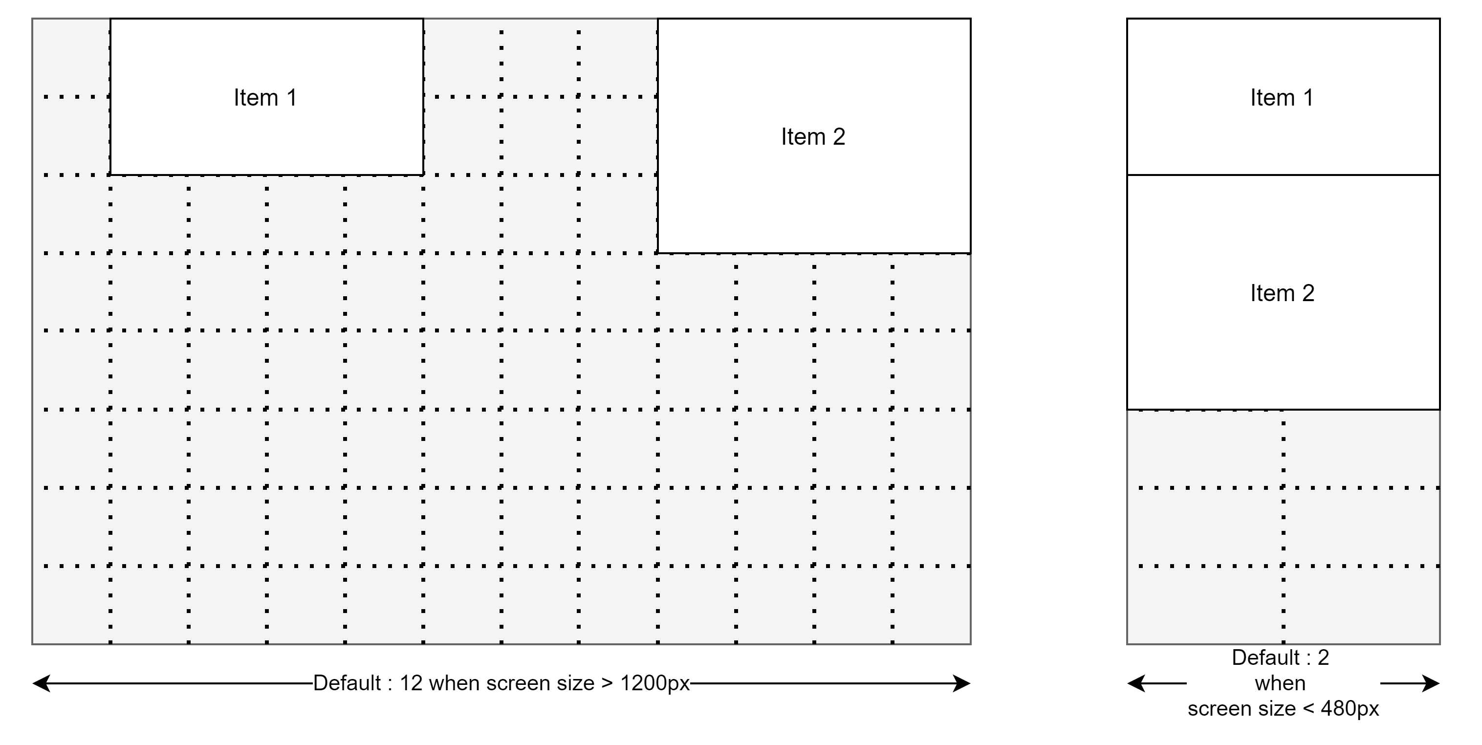
The responsive layout is characterized by breakpoints that change the format of the grid according to the screen size.
By default, the breakpoints are defined as follow: {lg: 1200, md: 996, sm: 768, xs: 480, xxs: 0} (value in pixel).
The default number of columns of the grid is defined as follow : {lg: 12, md: 10, sm: 6, xs: 4, xxs: 2}. But this parameter can be changed using the argument gridCols.
The default size and position of the items can be set using the layouts argument. (see the example and also react-grid-layout#responsive-grid-layout-props)
For more information on dash_draggable.ResponsiveGridLayout see : Responsive layout - ResponsiveGridLayout
Examples
You can see other examples in the github repository of the project:
- With a fixed size layout:
Basic example: examples/simple_example/simple_example.py
Example using the layout argument: examples/layout/layout-argument.py
- With a responsive layout:
Basic example : examples/simple_example/simple_example-responsive.py
Example using the layout argument: examples/layout/layout-argument-responsive.py
Reference
Fixed size layout - GridLayout
- dash_draggable.GridLayout
- Description:
GridLayout is a component for building dashboards with draggable and resizable items.
By default, GridLayout will saved the position of each element on the client side. But you can also save it on server side by defining a callback with :
Input(“<my-id>”, “layout”).
- Arguments:
- children [list]:
a list of dash components
- id [optional, str]
id of the component
- layouts [optional, dict]
A list where each value gives the position (x, y) and the size (h, w) of the components added to children :
[{"x": number, "y": number, "w": number, "h": number}]see here for an example
- save [optional, default=True]
save the position of elements on client side, if True.
- clearSavedLayout [optional, default=False]
allows you to clear the saved position and size of elements, when the page loads.
- ncols [optional, default=6]
default width of components added to children ; measured in number of columns (the default number of columns of the grid is 12, see
gridCols).
- nrows [optional, default=8]
default width of components added to children ; measured as a multiple of
height(default valut is 30px).
- gridCols [optional, default=12]
number of columns for the grid.
- width [optional, default=1200]
width of the grid (in pixels).
- height [optional, default=30]
height of the rows of the grid (in pixels).
- className [optional, str]
additional classes passed to react-grid-layout#grid-layout-props
- style [optional, dict]
additional styling passed to react-grid-layout#grid-layout-props
Responsive layout - ResponsiveGridLayout
- dash_draggable.ResponsiveGridLayout
- Description:
ResponsiveGridLayout is a component for building dashboards with draggable and resizable items.
By default, ResponsiveGridLayout will saved the position of each element on the client side. But you can also save it on server side by defining a callback with :
Input(“<my-id>”, “layouts”)(Input(“<my-id>”, “current_layout”)for the layout specific to the current screen size).
- Arguments:
- children [list]:
a list of dash components
- id [optional, str]
id of the component
- layout [optional, dict]
A dictionnary where each key is a breakpoint and each value is a list of dictionnary (similar to
layoutfor dash_draggable.GridLayout) giving the position (x, y) and the size (h, w) of the children :{lg: [{"x": number, "y": number, "w": number, "h": number}], ...}see here for an example
- save [optional, default=True]
save the position of elements on client side, if True.
- clearSavedLayout [optional, default=False]
allows you to clear the saved position and size of elements, when the page loads.
- breakpoints [optional, default={lg: 1200, md: 996, sm: 768, xs: 480, xxs: 0}}]
breakpoints defined by the screen size (value in pixels).
- ncols [optional, default={lg: 6, md: 5, sm: 3, xs: 4, xxs: 2}]
default width of components added to children ; measured in number of columns (depending on the screen size).
- nrows [optional, default=8]
default width of components added to children ; measured as a multiple of
height(default valut is 30px).
- gridCols [optional, default={lg: 12, md: 10, sm: 6, xs: 4, xxs: 2}]
number of columns for the grid (depending on the screen size).
- height [optional, default=30]
height of the rows of the grid (in pixels).
- className [optional, str]
additional classes passed to react-grid-layout#grid-layout-props
- style [optional, dict]
additional styling passed to react-grid-layout#grid-layout-props